Roche
A set of brochures that won the Zlatý středník award in 2022


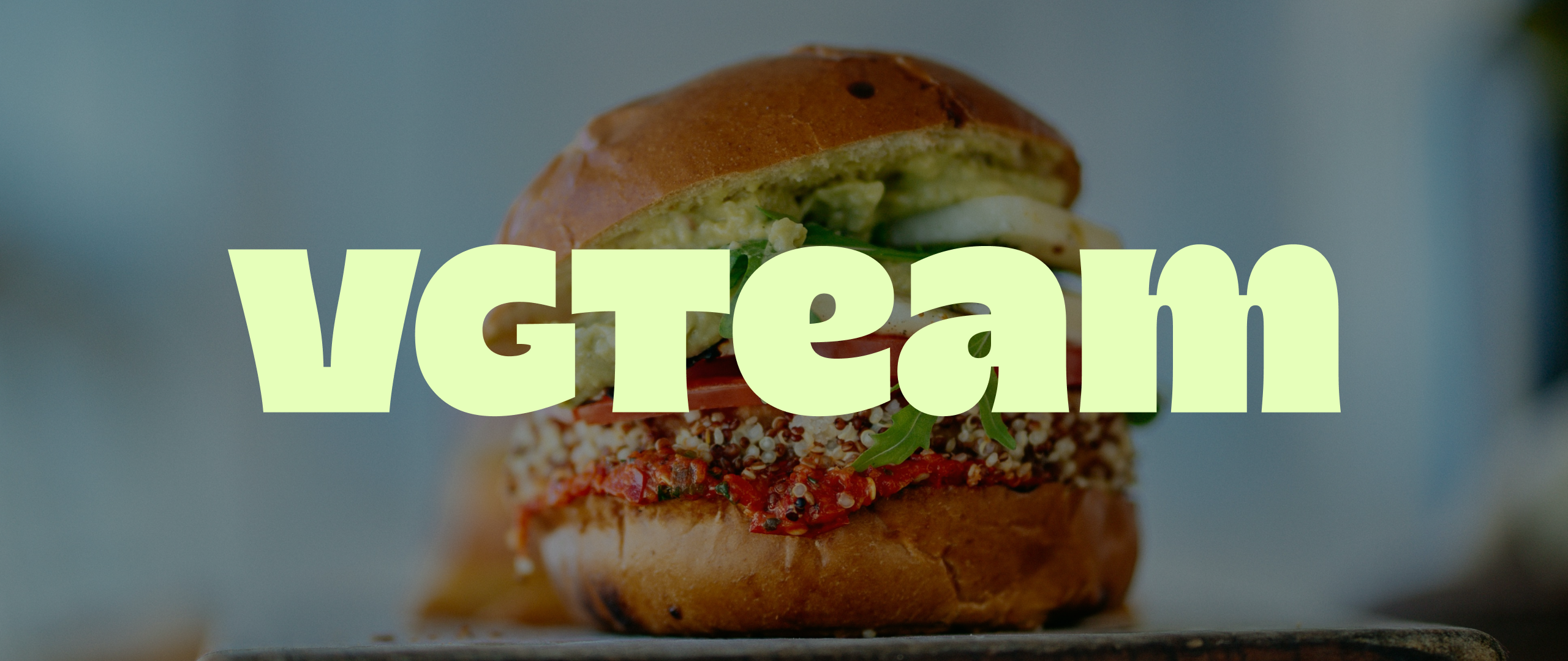

Ukraine's Vegetus lost its production twice and rebuilt it twice. Alex and Larysa Gonsky started producing plant-based sausages in Kharkiv in 2007, Russian rockets drove them out in 2022, and in September 2024 a flood swept through their production site in Česká Ves near Jeseník. Now they are heading back to market with Czech production, into supermarkets and onto Rohlík, where Green Heads (another of our clients) handles their distribution. The products taste good and they are made well, but nobody on the shelf knows that before picking one up. So they needed a brand that lands at first glance and carries the product lines still to come.
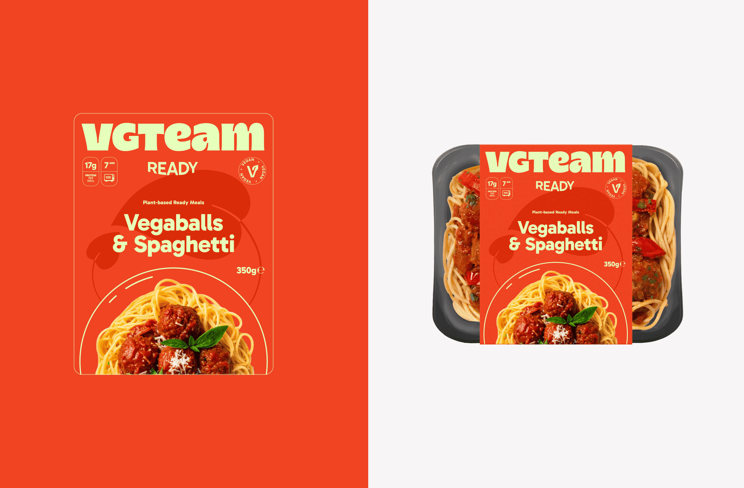
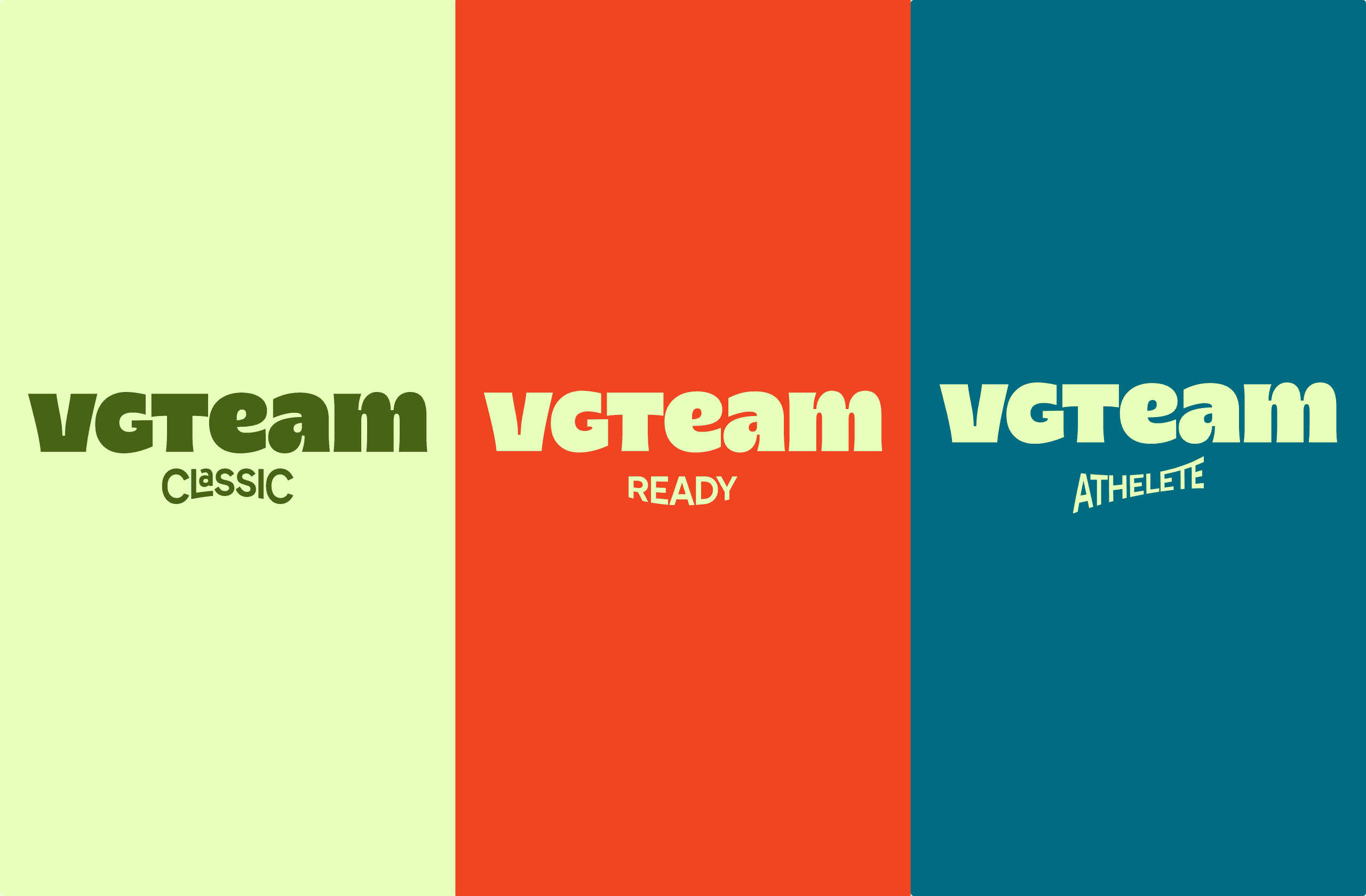
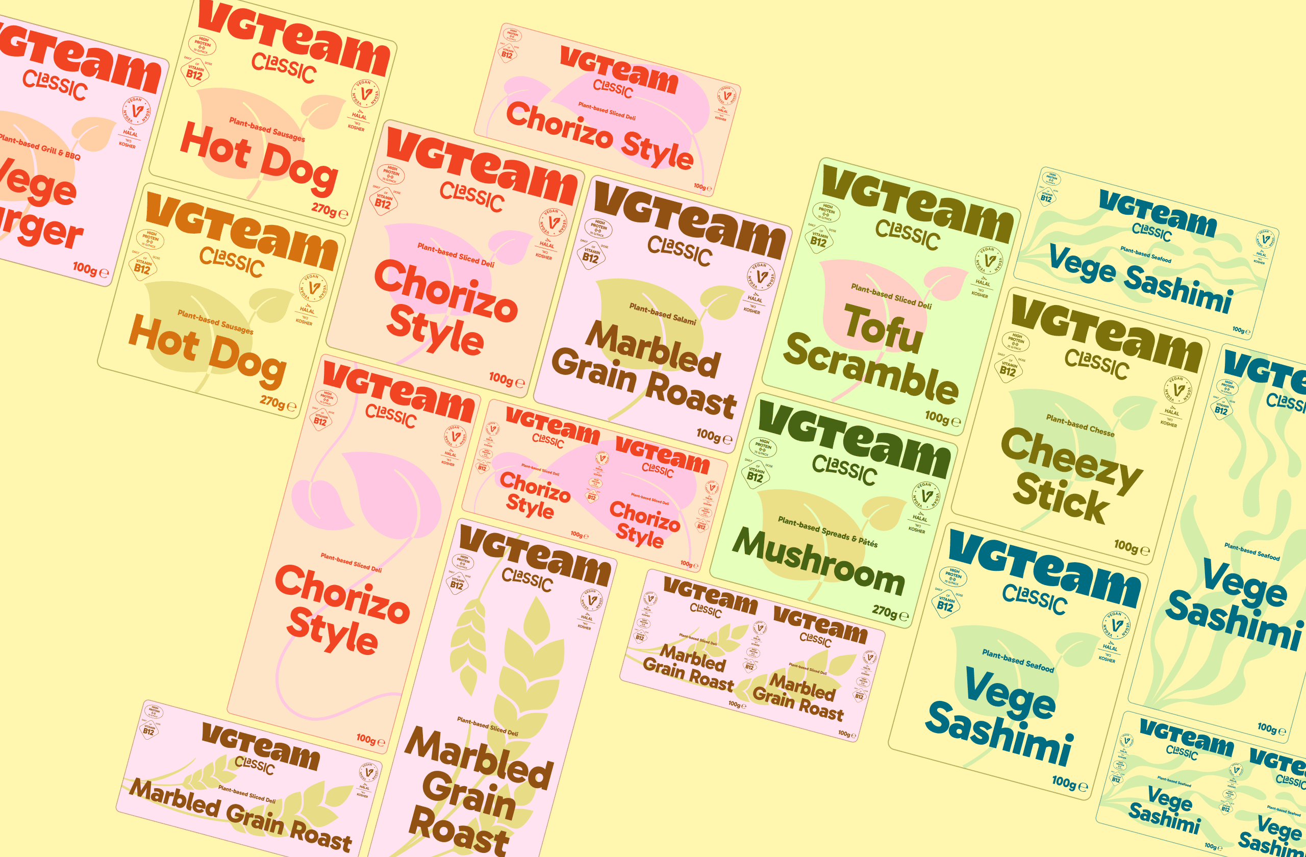
For the Czech market, Vegetus became VGTeam, and alongside the master logo we drew a dedicated logotype for each product line, all cut from the same wordmark: Classic sits on traditional letterforms, Ready puffs up into inflated curves that echo a meal changing shape in the microwave (and, if you squint, the smile that comes with food ready in minutes), Athlete stretches into motion. The lines separate before a shopper reads a single word. To make that hold across the whole range, we built VGTeam a colour and illustration system with clear rules. Every product got its own colour pair, a darker upper half and a lighter lower half of the pack, plus side stripes in the colour of the product name. The illustration motif follows the recipe rather than the mood: grain when the product contains cereals, soybeans when soy is the primary ingredient, seaweed when the product is enriched with it, and the leaf as the default for everything else. Each motif also comes in square, portrait and landscape variants, so it always fills the surface properly whatever the product.
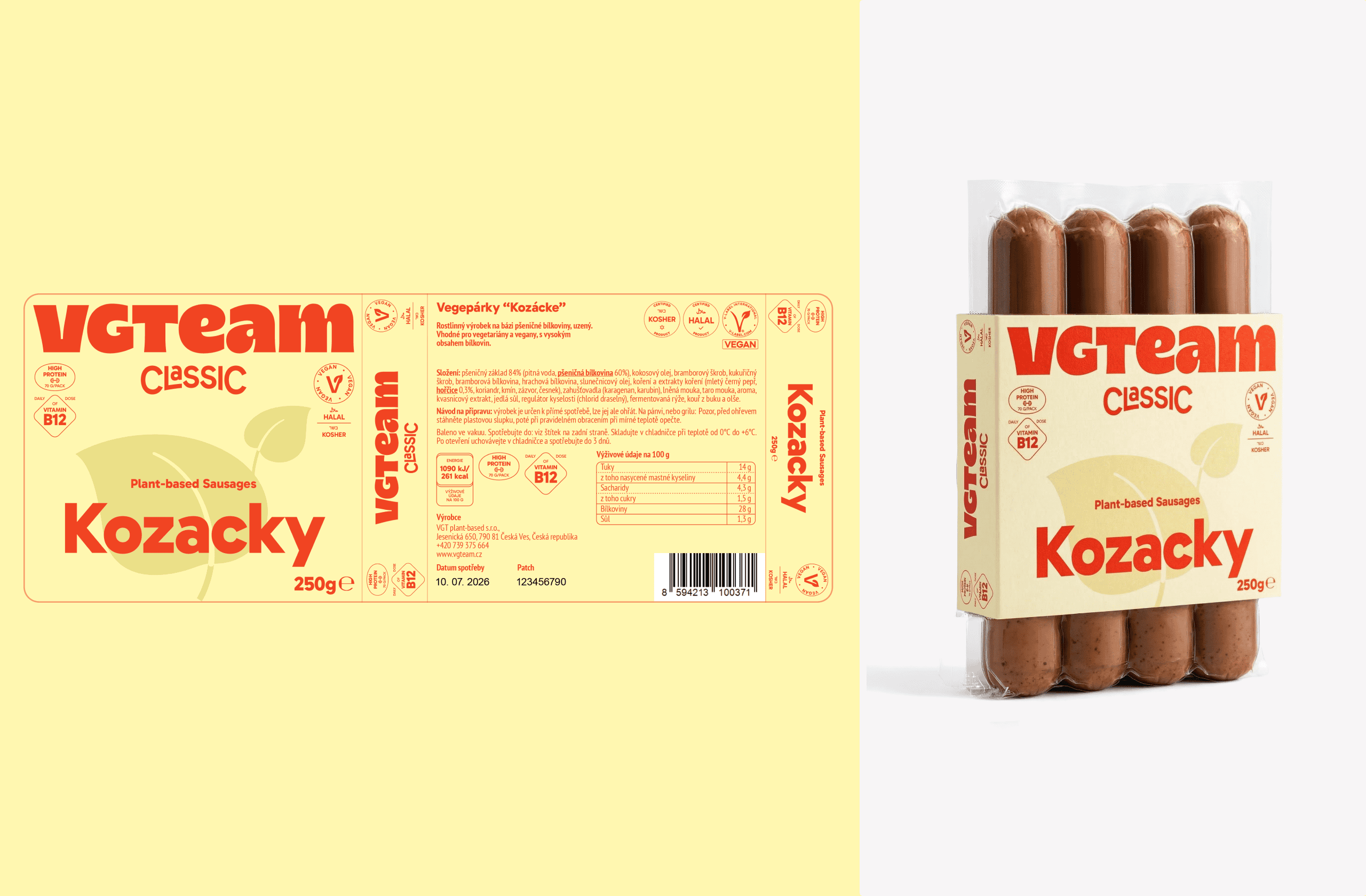
Our longest debate with the client was about photography on the packs themselves. We held the line that a photo belongs only where it genuinely adds something, meaning a full prepared meal, where the shopper needs to see what they are about to heat up. When the product looks good on its own, there is no point in covering it: the paper sleeve shrinks and the product stays visible through it. The rest of the surface then belongs to the elements that have to repeat if anyone is going to remember the brand at all. That was the main argument for the minimalist design we eventually agreed on.
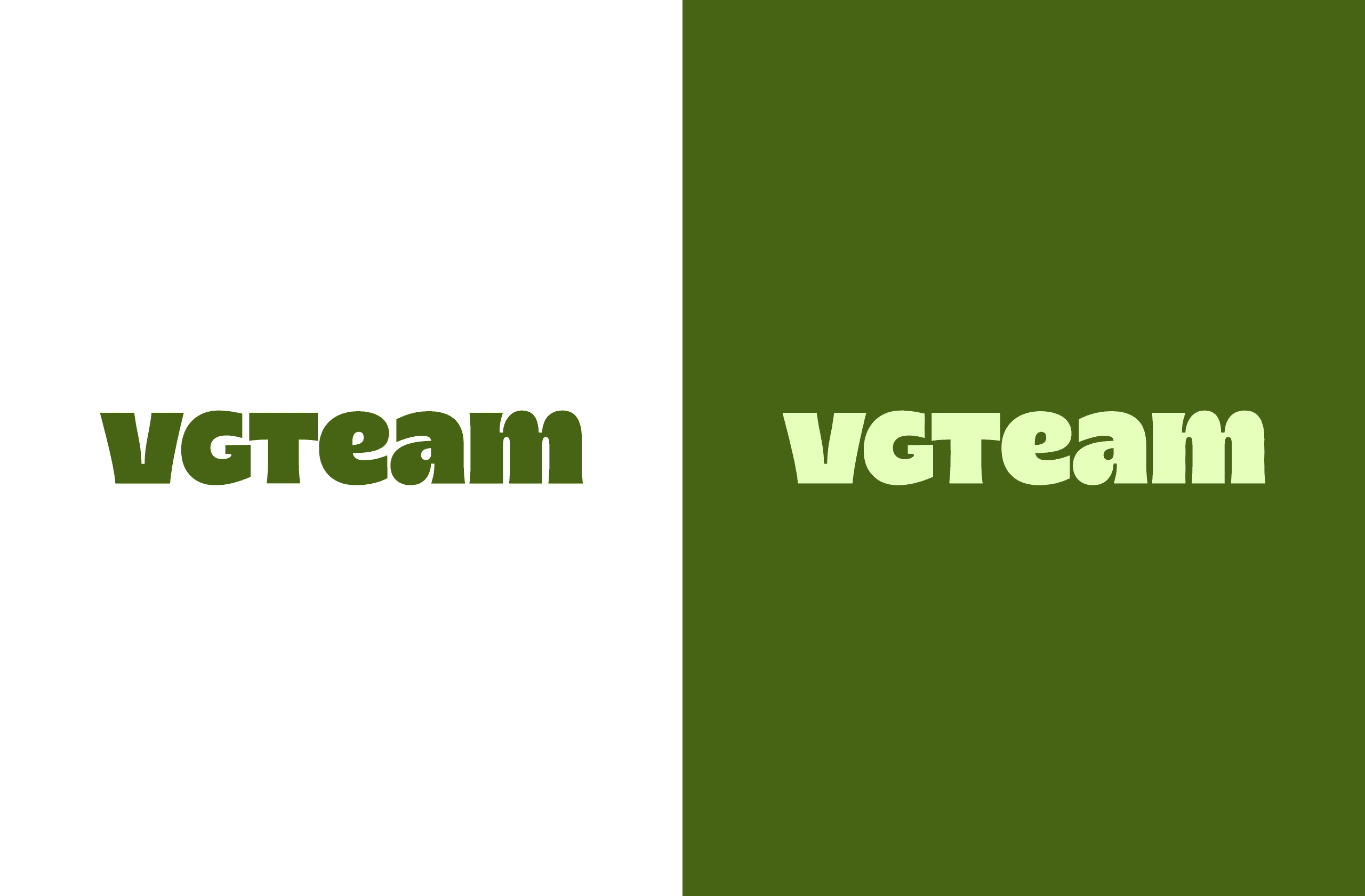
The skeleton of the pack stays fixed and only the colour and the motif move. Six packs side by side on the shelf therefore hold as one block and claim the space they would fragment individually. The same decision pays off when the pack shrinks to two centimetres in the Rohlík app: a big wordmark and a colour block survive there, a photo of food with small type would not. We handed over a full identity manual: the VGTeam logo and the Classic, Ready and Athlete line logotypes in positive, inverted and black-and-white variants, the palette with its tints, the typography (Gabarito up front, PT Sans Narrow where the back of a pack runs out of room), the illustration set and sample packaging for every line. Vege Cheese, Kozacky, Tomato, Spinach, Hot-dog, Sardelki, each product gets its own colour pair and all of them hold together in one system. The real result is not any single pack: with the manual in hand, the client's designer draws the next product alone, without the brand falling apart or the packs blurring into one another on the shelf.