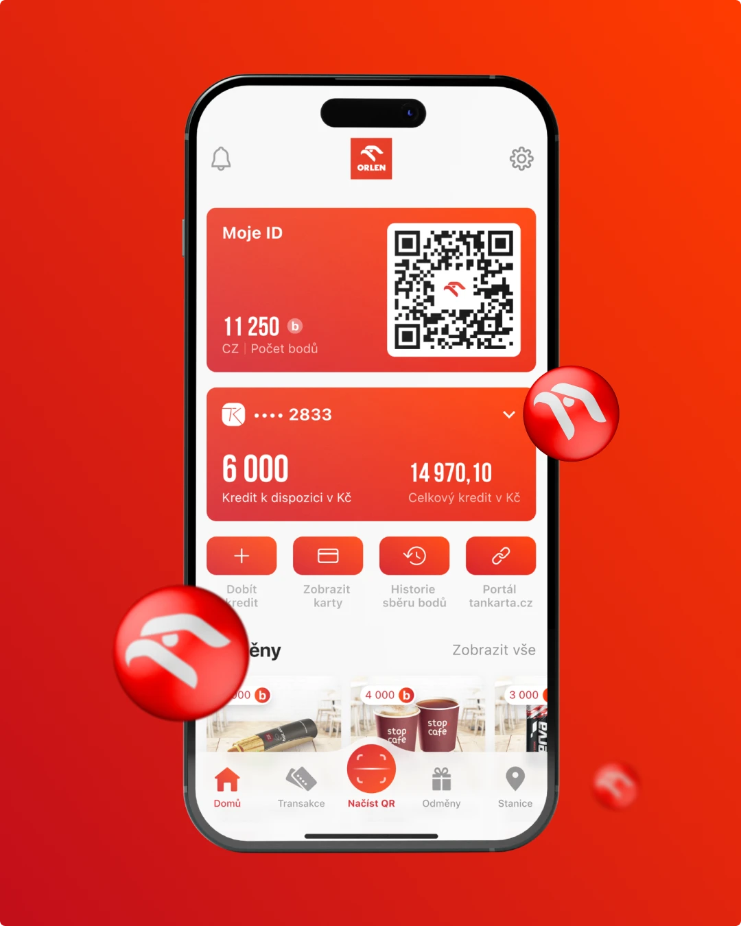
Orlen
No items found.
The design and development of a mobile app for the largest network of petrol stations in the Czech Republic




SCIO is a name almost every Czech high schooler knows. Every year, more than 36,000 applicants take their National Comparative Exams (Scio.cz, 2025). Chci na vejšku is their project built to solve a completely different problem: choosing the university itself.
Choosing a university is a more serious problem than it might seem. Almost 60% of bachelor's degree attempts in the Czech Republic end without completion, and at some technical faculties that figure reaches 90% (iROZHLAS, 2018). The main cause isn't a lack of ability, but a mismatch between what a student expected from a field and what it actually involves. The goal of Chci na vejšku is to help prospective students navigate hundreds of schools and fields and find what actually makes sense for them, before that mismatch has a chance to catch up with them.
The client came to us with a design in progress that they themselves didn't consider finished, and needed a second opinion on it: comment on what worked and what didn't, and propose how to bring it to its final form. The goal was clear: get the product to 100%, to a state that's finished, consistent, and ready to go in front of real users.
We went through what the client had, gave them concrete feedback, and together assessed where to take the project next. We agreed the best path was to take the portal from scratch: building it on a new internal UX analysis and, above all, on real user testing, with a new wireframe design and the design work that followed.
To keep the process from staying purely theoretical, we designed a first version of the wireframes straight away, so we could take them into a pre-test with users. Shadcn components only came into play later, in the final design phase.
With the first wireframes, we ran a pre-test with an initial group of respondents, combined with a user interview. It was meant to confirm or rule out the frustrations and problems we'd expected from the target audience. This small, fast round ended up mattering more for validating the concept than the larger test that came later: it confirmed the direction (a listing of schools and programs makes sense) and showed which features would matter most to users and why they'd bother registering at all. We test even in a project's early stages like this, to quickly validate possible directions before more work gets invested in them. It was a scrappy effort in the best sense: we agreed on the plan on a Wednesday, and the following week we tested almost every day until around nine in the evening, since high schoolers only have time after school, and our UX designer Jakub happened to be in Nairobi at the time, so the whole round ran online. Six respondents took part across different years and areas of interest, averaging 45 minutes each.
We built the pre-test's findings into the wireframe, which fed into a final round of testing, this time directly with nine to ten prospective students (one-hour sessions per respondent, tested on mobile, including recording thumb movement across the screen). It validated navigation on the site and whether the portal's behavior matched how users pictured it themselves – and this is where it turned out that at the "Search" button, they expected a checklist of fields of study, not a text field. That makes sense: a high schooler often doesn't know the academic name for what interests them. They know they like building computers, but have no idea that at university it's called "Cybernetics and Robotics," so they wouldn't even type the right term into a search box. We connected the search to a structured selection of fields, so users wouldn't be left facing an empty field.
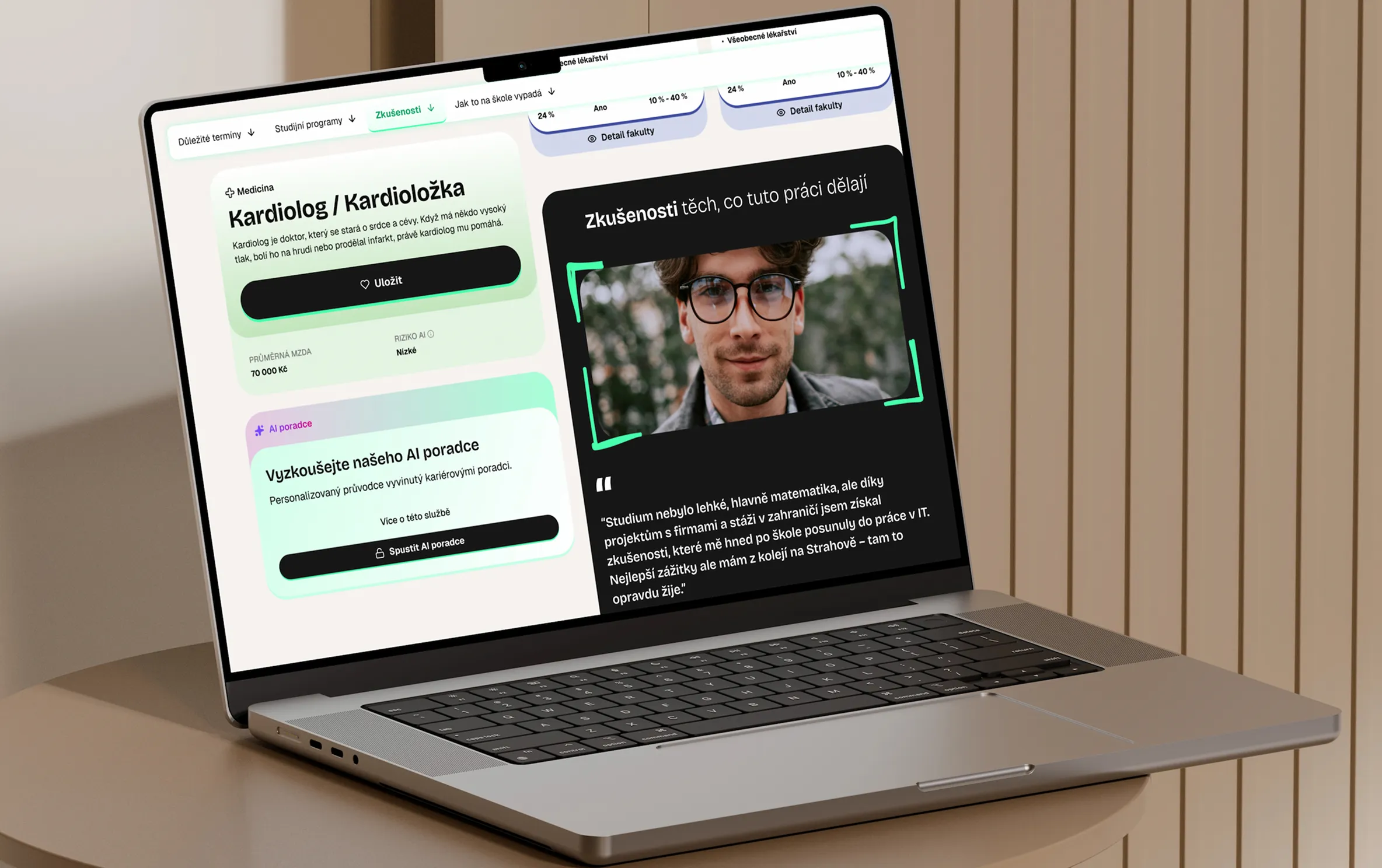
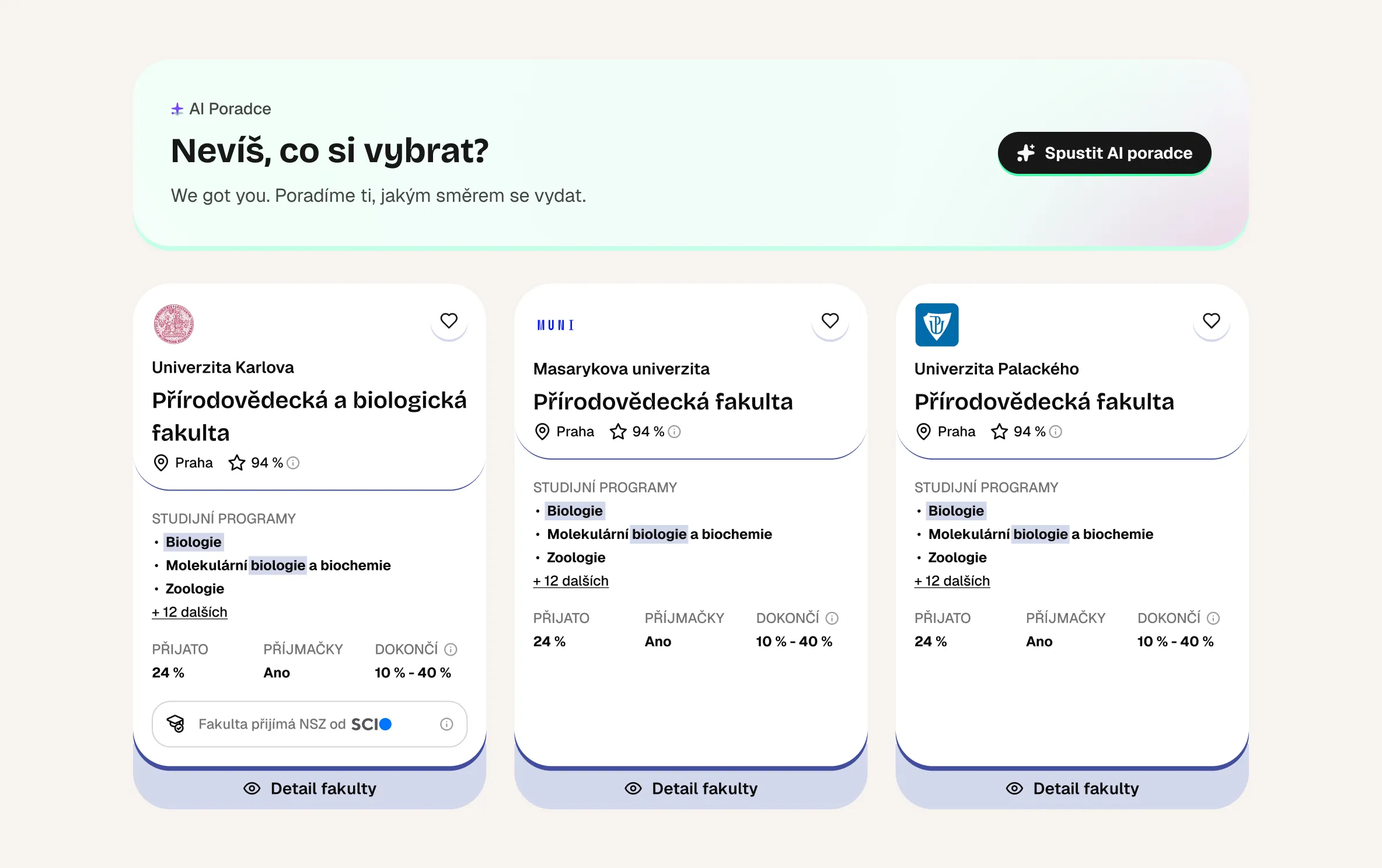
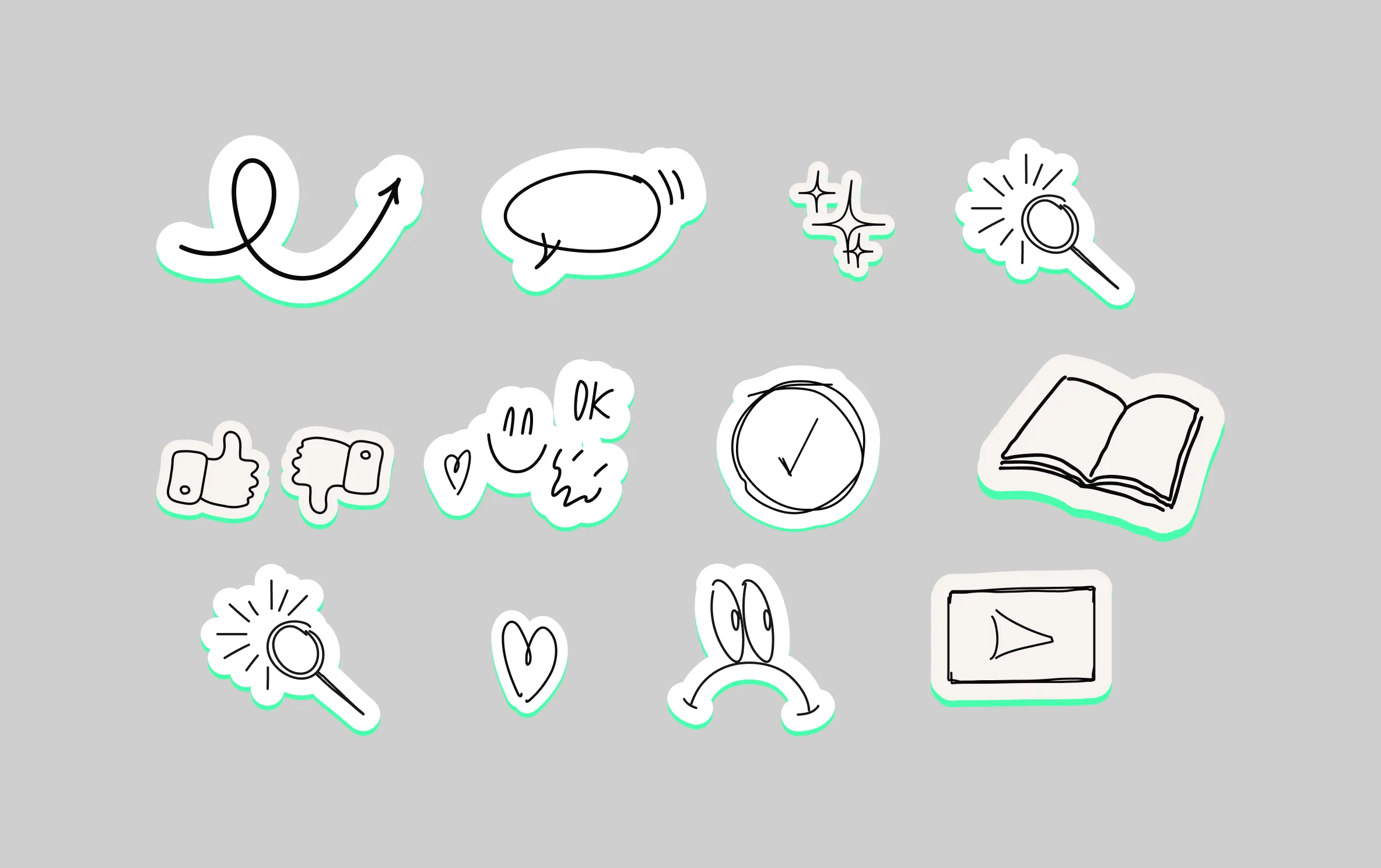
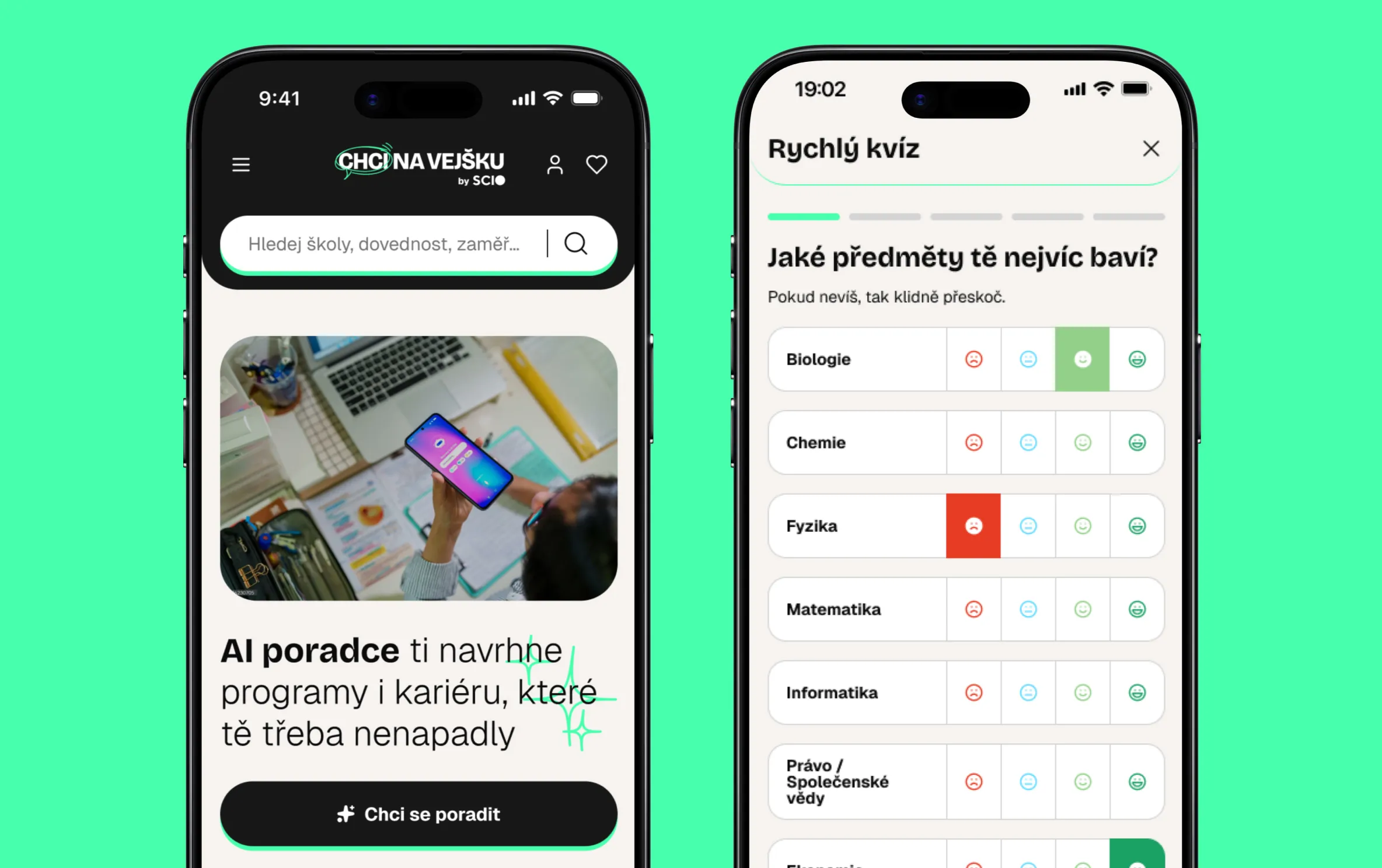
We didn't build the design on the default look of shadcn components alone – we completely recolored and adapted them into our own visual language, and custom-built whatever the library was missing. The result is a fresh color palette anchored in one bold mint color, paired with clear black-and-white contrast that keeps the whole site organized and readable even with this much content – a dark navigation bar and header, black testimonial cards, cream-colored section backgrounds. We rounded it out with hand-drawn illustrative elements (underlines, arrows, scribbles) and photography aimed squarely at the target audience – no generic stock photos of adults in offices, just real high schoolers.
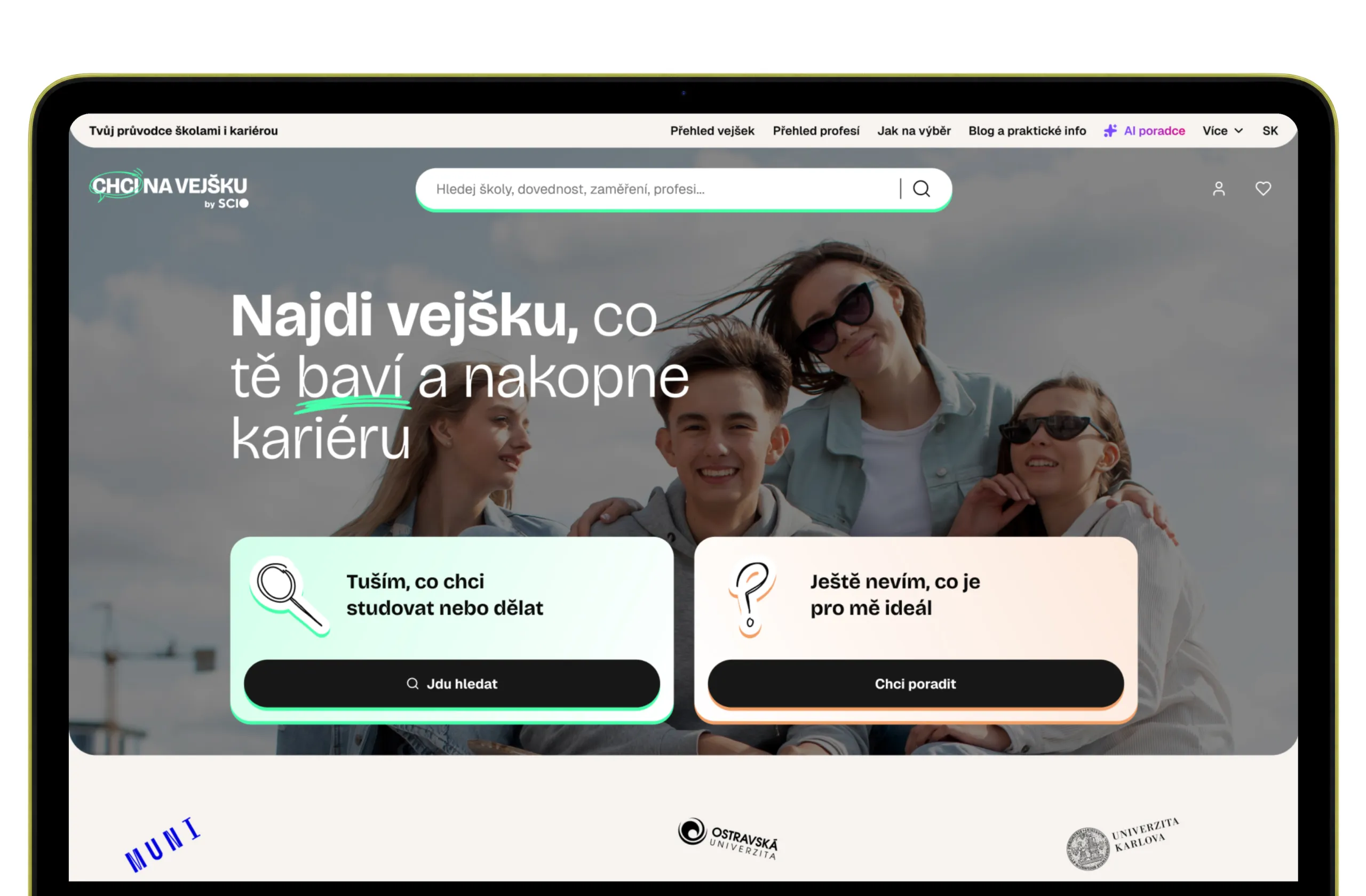
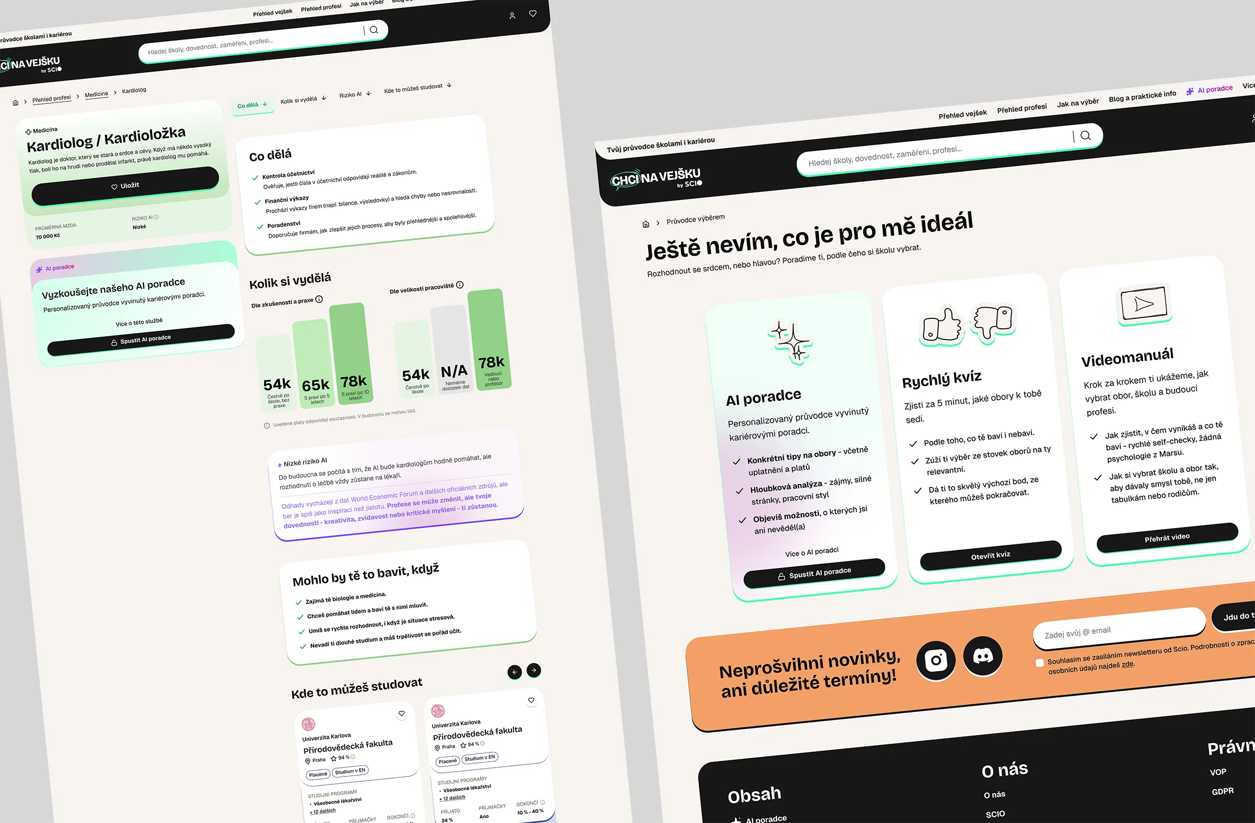
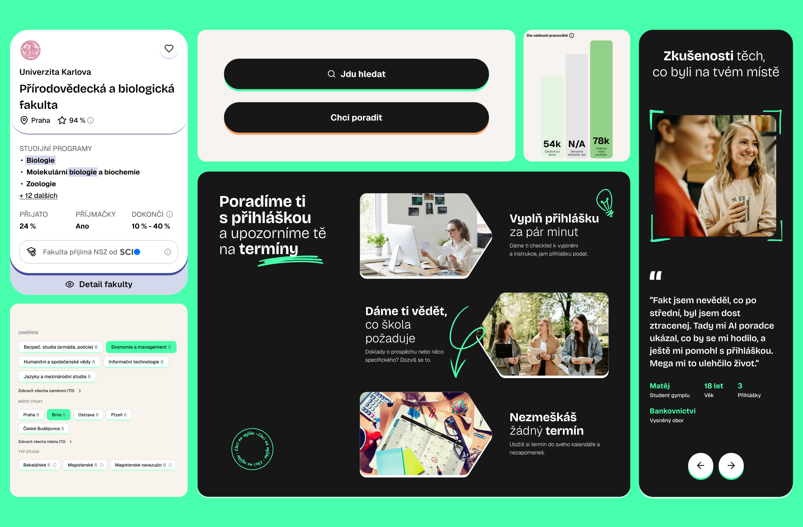
Testing confirmed the chosen design direction works. Respondents made it through the core flows without major snags, and we used their behavior to fine-tune small details across the portal. The two-card dispatcher on the homepage – "I have an idea what I want to study or do" (mint card) and "I still don't know what's right for me" (a second card in warm peach) – worked flawlessly for every respondent without a single moment of hesitation, so we deliberately kept it dominant in the design.
We similarly had to rework the quick "What I enjoy" quiz. A binary yes/no on school subjects forced respondents to guess on anything they felt ambivalent about, which would have skewed the recommendations. We replaced it with a four-point scale – dislike and don't want to, dislike but can manage, enjoy but not good at it, enjoy and good at it – which gave a far more accurate basis for what the portal recommends to each user.
But testing showed the most energy around two specific parts of the product. The first is the profession database, where every listing shows an estimated salary alongside an "AI risk" score (an estimate of how much automation is likely to affect that job). Respondents actively clicked into this detail on their own, and the salary information alone was compelling enough that even users who were skeptical about registering started seriously considering it. The second is the AI advisor. Testing surfaced a clear question users kept asking: "Why would I get advice here when I can just ask ChatGPT the same thing for free?" It turned out the "AI" label alone doesn't convince anyone today: the advisor has to justify what makes it different (it knows the Czech admissions system, open house dates, specific fields of study), and that needs its own clear page, not just an icon in the menu.
We didn't build the portal itself. Our work ended at a finished, user-tested design and component system that the client's team could build on. Even so, it's one of the largest-scale design products we've worked on: a full digital product with its own logic, language, and system that has to hold up on every single visit, one we validated for real with the people it's actually built for.